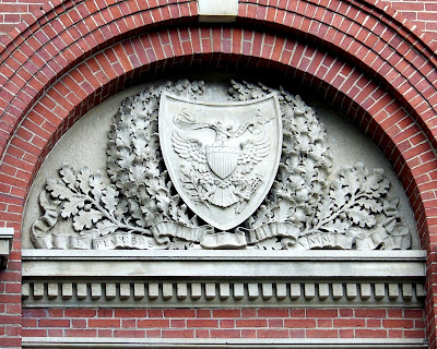
Continuing to look at how heraldry is not like logos and trademarks, we come to several different depictions (some incorrect!) of the arms of the United States of America that we came across in our 2008 trip to Massachusetts.
For the error, if you look closely (and you may want to click on the image above to see a larger version), there should be no stars on the chief. The arms of the U.S. are blazoned: Paly of thirteen argent and gules a chief azure. No stars.
The weirdness is that they have placed the entire achievement of arms – arms, supporter holding a branch of laurel and a sheaf of arrows, and motto, but without the crest – on a shield! Maybe it's just me, but I find that to be very weird.
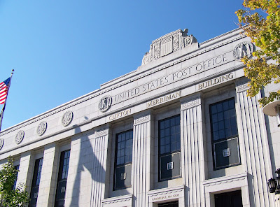
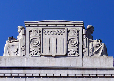
Next was another Art Deco depiction of the arms of the U.S. over the main entrance to the United States Post Office in Boston.
Here again, I personally like Art Deco depictions of heraldry, but once again, they have placed stars on the chief, which is an error.
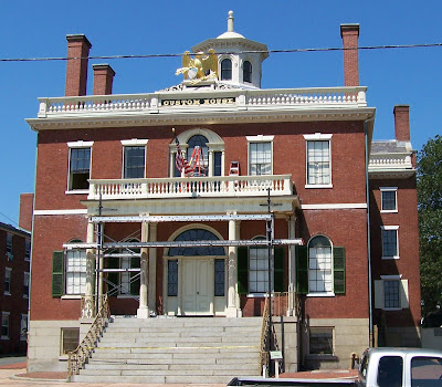
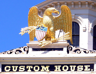
And finally, we run up to the town of Salem, Massachusetts, about 18 miles northeast of Boston, where the old Custom House (where author Nathaniel Hawthorne worked for three years) has yet another (and this time, doubly incorrect!) depiction of the arms of the United States.
Although the overall way that the eagle manages to hold the laurel branch and arrows as well as shield are somewhat attractive, the shield of the arms repeats the error of placing stars on the chief, and then adds another error, by reversing the colors of the red and white stripes; the outside (dexter and sinister) stripes should be white, and then alternating with red. (I suppose I could also argue that the eagle is ten arrows short in his sheaf, as their properly ought to be thirteen, but I think that doing so would just be "piling on", don't you?)
And there you have it! Three widely different versions of the arms of the United States, each attractive in its own way, and yet each wrong.


No comments:
Post a Comment