Thursday, April 28, 2022

Fight Fiercely, Harvard. Fight, Fight, Fight!


Those are some of the words to an old Tom Lehrer song.

He was a mathematician at Harvard University, who for several years in the Sixties also wrote songs, including what he suggests would have been a more appropriate fight song for Harvard. ("Demonstrate to them our skill! Albeit they possess the might, nonetheless we have the will! Oh, we shall fight for Harvard's glorious name; won't it be peachy if we win the game? Oh, goody. Hurl that spheroid down the field, and fight! Fight! Fight!")

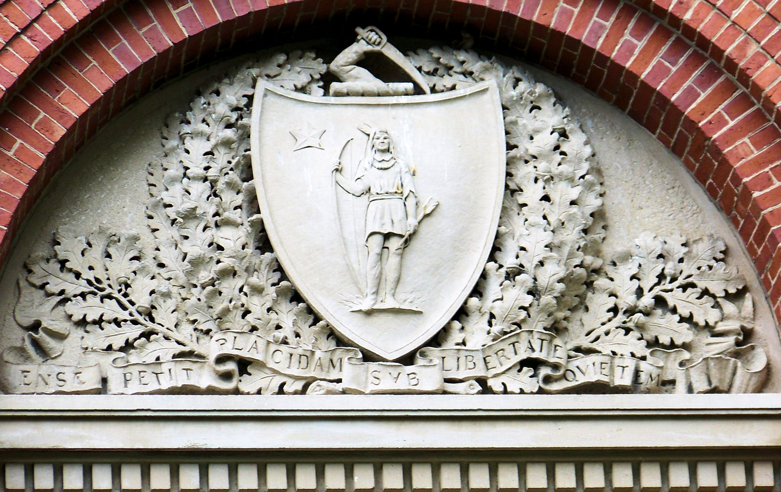
Anyway, we were staying at a B&B in Cambridge, and had the opportunity over several days to stroll across and around the Harvard University campus. I've already shown you some of the arms that appear there in my last couple of posts: the arms of the United States, and those of the Commonwealth of Massachusetts.

Well, today we're going to look at some of the depictions of the arms of the University itself, scattered here and there about the campus.

A blazon, I suppose, would be: Gules three open books argent bound and clasped or thereon the word VE RI TAS sable, if you keep in mind that the "gules" they use is often more of a "maroon" than a true "red". (This is not to say that you can't find a lot of depictions of the arms with red, only that you more often see it as a darker blood-red or maroon, like on the cap and tee shirt I bought there with the arms on them.)

Anyway, with all that as background, here are images of some of the coat of arms of Harvard University found on the campus in Cambridge, Massachusetts.

Over a doorway, flanked by the arms of the State of New York (left) and the Commonwealth of Massachusetts (right):


Over another doorway, flanked by shields which are not so much coats of arms as printers marks (on shields) for Caxton, Rembolt, Fust & Schœffer, and Aldus, all famous early printers.


Elsewhere, a bird has made of Harvard (and Harvard's coat of arms) a home:


In addition, there were a couple of versions harking back to Harvard's early years as a school of divinity in the Colony of Massachusetts Bay, where it was used on the college seal in 1650 and thence up until about 1800. These versions have a chevron between the three books, the upper two of which are face up, and the lower one of which is aversant (which can be seen best in the lower image). The upward facing books symbolize the truth that is discernible through our five senses; the overturned book symbolizes that which can only be known through the illumination of the Holy Spirit.

The first two pictures are of the same carving, and contain the motto Christo et Ecclesiae (Christ and the Church):


And through all of these, we now have, if you will pardon the pun, a "college" education!

Monday, April 25, 2022

Guess Where You'll See Many Depictions of the Coat of Arms of Massachusetts


Aw! You guessed.

But that's right! In the Commonwealth of Massachusetts!

We saw quite a number of versions of the Massachusetts arms as we traveled about the eastern end of the state.

A good blazon of the arms would be: Azure, a Native American statant holding in his dexter hand a bow and in his sinister hand an arrow or in dexter chief a mullet [of five points] argent.

A legal, less heraldic description of the arms can be found on the website of the American Heraldry Society: A shield having a blue field or surface with an Indian thereon, dressed in a shirt and moccasins, holding in his right hand a bow, and in his left hand an arrow, point downward, all of gold; and, in the upper corner of the field, above his right arm, a silver star with five points.

Here's what it looks like in color, from the state flag flying in front of the Police Headquarters in Milford:


The crest is: An arm embowed vested and grasping a broadsword or.

And the motto: Ense petit placidam sub libertate quietem (By the sword we seek peace, but peace only under liberty.).

The arms, crest, and motto were adopted by Governor John Hancock and his Council on December 13, 1780.

Anyway, with all that a background, here are some of the other depictions of the arms we saw while we were there. Here's one from the façade of the Boston Library:


And a couple from the grounds of Harvard University in Cambridge. One becoming worn from the weather ...


And the other, more protected, in wonderful condition:


Not necessarily the best heraldry, or the most culturally sensitive, but you have to remember that it was designed by committee, in 1780, in the middle of a war (1775-1783). So there's that.

In any event, it's what they use, and as a non-resident, I'm not really in a position to tell them to change it. (Now if they asked me about it, yeah, I could give them some suggestions!)

Thursday, April 21, 2022

Differing, But Erroneous, Depictions of the Arms of the United States


Continuing to look at how heraldry is not like logos and trademarks, we come to several different depictions (some incorrect!) of the arms of the United States of America that we came across in our 2008 trip to Massachusetts.


The first one we found on the grounds of Harvard University in Cambridge, Massachusetts. It's a fairly stock depiction of the arms of the U.S., though it does have an error, and a weirdness.

For the error, if you look closely (and you may want to click on the image above to see a larger version), there should be no stars on the chief. The arms of the U.S. are blazoned: Paly of thirteen argent and gules a chief azure. No stars.

The weirdness is that they have placed the entire achievement of arms  arms, supporter holding a branch of laurel and a sheaf of arrows, and motto, but without the crest  on a shield! Maybe it's just me, but I find that to be very weird.


Next was another Art Deco depiction of the arms of the U.S. over the main entrance to the United States Post Office in Boston.

Here again, I personally like Art Deco depictions of heraldry, but once again, they have placed stars on the chief, which is an error.


And finally, we run up to the town of Salem, Massachusetts, about 18 miles northeast of Boston, where the old Custom House (where author Nathaniel Hawthorne worked for three years) has yet another (and this time, doubly incorrect!) depiction of the arms of the United States.

Although the overall way that the eagle manages to hold the laurel branch and arrows as well as shield are somewhat attractive, the shield of the arms repeats the error of placing stars on the chief, and then adds another error, by reversing the colors of the red and white stripes; the outside (dexter and sinister) stripes should be white, and then alternating with red. (I suppose I could also argue that the eagle is ten arrows short in his sheaf, as their properly ought to be thirteen, but I think that doing so would just be "piling on", don't you?)

And there you have it! Three widely different versions of the arms of the United States, each attractive in its own way, and yet each wrong.

Monday, April 18, 2022

Welcome to David Appleton's "Art Deco Fun With Heraldry"!


And Art Deco fun with heraldry-like objects.

As I threatened promised you, today we' re going back a few years, to a trip we took to the Commonwealth of Massachusetts a long, long time ago (2008).

And I'm going to continue, at least a little bit, on the theme of my last two posts: the fact that heraldry is not a logo or trademark, and so can be depicted in more than one way.

Anyway, in our travels about the city of Boston, we ran across some heraldry (and some heraldry-like objects) depicted in an Art Deco style, that for some reason I find especially attractive. (I've never considered myself to be much of an Art Deco kind of guy; I tend to prefer the curves and swirls of Art Nouveau. But what can I tell you? I really like heraldry done in an Art Deco style.)


These are the arms of Pope Pius XII (Eugenio Maria Giuseppe Giovanni Pacelli), who was Pope from 1929 to 1958. His arms are blazoned: Azure a dove close reguardant argent holding in its beak an olive branch proper, atop a trimount argent issuant from a terrace vert, a base barry engrailed argent and azure.

Here the arms are surmounted by the crossed keys and triple tiara of the Papacy, with four tassels filling the role normally taken by cloth mantling.

There were some other decorative plaques on the building as well:


A cross paty issuant from a chalice, presumably representative of the Eucharist, framed by laurel branches.


A double (six-petalled) rose.


A lymphad (ship) sailing on waves of the sea, it's pennon and mainsail charged with a cross, and atop the stern, a dove rising wings displayed.


And finally, and slightly more heraldic than the others, an eagle displayed issuant from a ducal, or crest, coronet.

All of these done in a classically Art Deco style.

Are you as attracted to these depictions as I am?

Thursday, April 14, 2022

How a Coat of Arms Is Different From a Logo, Part 2


In our last post, we looked at a wide variety of renditions of the coat of arms of Heidelberg, Germany, as an example of the variety that you can get in heraldry that you cannot do with a logo or trademark.

This time, we're going to look at a personal coat of arms, and some of the many differing examples of it. But no matter how different they may seem, they all follow the blazon, and are all the same coat of arms.

First, a comparatively "plain vanilla" version of the arms Argent two chevronels azure between three apples gules slipped and leaved vert.


(Full disclosure: Yes, this is my coat of arms, designed by myself, and used publicly since 2002. Some versions of it also come with a crest: An apple tree fructed proper.)

In the ensuing 20 years, I have created a few other slightly modified versions:


But the real fun has come from having other artists more skilled than I create their interpretations. Like this one from the roll of arms of attendees at the 2002 International Congress of Genealogical and Heraldic Sciences in Dublin, Ireland:


Or this simply sketched one for his Liber Amicorum (Book of Friends) by Magnus Backmark:


By Antonio Salmeron:


By Dennis O'Meskel MacGoff:


By John Rafael (with the crest):


A black and white pencil drawing by Ronny Anderson:


And a library painting by Sunil Saigal:

No, these are not even all of the different renditions that I have. But I wanted to save space for just a few examples of bookplates that I have created (thank you, clipart collections!) of my arms and crest, ranging from very Baroque to Art Deco to I'm not sure what (Classical Modernist?). You should be able to figure out for yourself which is which:


Once again, this is not the kind of variety you can get with a trademark or logo.

But in heraldry? The possibilities are limited only by your own imagination (or in my case, the quality of the clipart I have purchased and then modified). As the examples here, all of a single coat of arms, pretty clearly demonstrates, I think.

Monday, April 11, 2022

How a Coat of Arms Is Different From a Logo, Part 1


Last time we discussed trademarks and logos, and how they pretty much have to be reproduced identically every time. And how sometimes people think that coats of arms are like that; that each depiction should closely match every other depiction.

Well, heraldry ain't like that.

Indeed, one of the pleasures that many of us get out of heraldry is to see the different ways that artists will interpret a blazon. But no matter how these depictions may differ from each other, they are all the same coat of arms!

Next time we'll see variants of a personal coat of arms, but today, we're going to see different versions of a municipal coat of arms: that of Heidelberg, Germany: Sable a lion rampant or armed langued and crowned gules atop a trimount vert.


Here's a pretty standard depiction of the Heidelberg arms, depicted in a stained glass window in the city.

But there are quite a variety of examples of this coat of arms in and around the town, ranging from the fairly Baroque:


All the way up to Art Deco:


And, of course, everything in between:


There are even some "freestanding" versions of the Heidelberg coat of arms, not displayed on a shield:


Though this last one has the lion holding a sword and an orb, items not seen in the coat of arms:


These are all variants that you would be unable to do with a trademark or logo. I mean, really, sometimes the lion has a single tail, sometimes two (double queued), and sometimes the tail begins as one but is split into two (queue-forchy). The crown it wears comes in many different forms. Usually the trimount is issuant from base, but in a couple of cases, it issues from base and goes up the side of the shield. There is a wonderful amount of variation in these depictions, something not found in different depictions of trademarks and logos.

But this is heraldry, folks! And so long as an example stays true to the blazon, then it, and all of the others like (and unlike) it, is a rendering of that coat of arms.

And that's one of the joys that I get from heraldry. How about you?

Thursday, April 7, 2022

How Is a Logo or Trademark Different from a Coat of Arms?


Frankly, an honest answer to the question posed above is, "Sometimes, not very much."

But let's start with defining some terms.

The term trademark refers to a recognizable insignia [e.g., a logo], phrase, word, or symbol that denotes a specific product and legally differentiates it from all other products of its kind. A trademark exclusively identifies a product as belonging to a specific company and recognizes the company's ownership of the brand. Trademarks can be registered, giving legal protections to the owner.

To register a trademarked logo, among other things, the owner will need to describe:

"The product(s) or service(s) the logo will represent, along the class of goods or services for which you’re registering the trademark"; and

"A .jpg image file of the final version of the logo or design. If your logo is in color, you also need a description of the colors and where they’re used."

This last part is important. Here, for example, is a well-known registered trademark:


The red color is specifically designated as "Pantone 484".

Were it some other color than Pantone 484 red, it technically would not be the registered trademark of the Coca-Cola Corporation of Atlanta, Georgia. For example:


That said, I wouldn't recommend changing the color of the Coke logo and use it as your own, whether for a brand of cola or any other purpose.

Still, my point here is that, unlike heraldry, where "azure" can be any one of a wide variety of shades of blue, "gules" can be any one of a wide variety of shades of red, and so on, trademarks (and logos) are far more restrictive.

The same is true of the shapes and letters on a trademark or logo. The font is specified; the shapes are described in detail, and cannot be altered. (Well, not without registering a new trademark with the new specifications, anyway.)

Here, again, heraldry gives us a wider range of options.

Take a blazon from the English College of Arms in 1694, for example: Vert a Colledge, or Edifice Mason'd Argent in Chief a Sun rising Or the Hemisphere proper.

These are the arms granted to the College of William and Mary in Williamsburg, Virginia. They appear on a seal used by the College from 1694 to 1783.


So what does a "Colledge, or Edifice" look like? Frankly, it looks like whatever the thinks it looks like.

And, indeed, a number of variants are noted by the College itself:

Buildings, full sun with human face, rays, feathery scrolled border with foliage, leaves crossed on field. Drawing from ___ Example in "Coat of Arms," University Archives Subject File Collection.

Buildings, full sun with human face, rays, scrolled border with foliage, flower on the left as observed, leaves crossed on field. Designed for the Frenchman's Map from Eric M. Simon of ____ of Pittsfield, MA.

Buildings, full sun with human face, rays, scrolled border, Latin inscription "Sig. Collegii R. et R. Gulielmi et Mariae in Virginia. Used by the Registrar's Office in 1947.

Buildings, full sun with human face, rays, drapery held with sconces, foliage, no text. Examples: College buildings including Tucker Hall, Blair Hall, Wildflower Refuge (no drapery).


Nonetheless, however, the College of William and Mary approached the College of Arms in London in the 1920s in an attempt to obtain a definitive example of what their arms look like. They received this:


(Please note the differences as well as the similarities of this depiction and the seal used above.)

Despite the freedom given in heraldry which allows for a wide range of potential depictions of a charge, the College of William and Mary has treated this example from the College of Arms as definitive, and has essentially turned it from a coat of arms into a logo/trademark.

Here are some examples of this:


And so, with these examples, we repeat our answer to the question posed in the title of this post: How is a logo or trademark different from a coat of arms?

"Sometimes, not very much."

Especially when a single depiction of a coat of arms is treated as if it is the only model to be emulated in all future depictions. That's not heraldry; that's a trademark.