York Brewery, not surprisingly based in York, England, displays in places around the city a couple of different heraldic logos that I quite frankly found to be of interest.
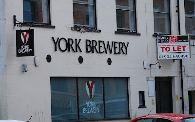
One of them is a beautifully simply, yet meaningful design, which we found just across the street from our hotel in York:
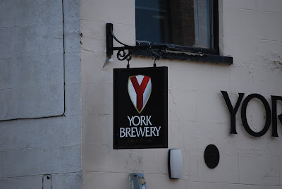
It's blazon is remarkably simple: Argent a pall gules. The colors are patently based on the arms of the city, with its white shield and red cross, and the design, as anyone looking at it can see, places a bright and bold red "Y" for York on the shield.
Clear, easy to identify, using just two colors (white and red), and consisting of a field and a single charge. It doesn't get much better than that for heraldry.
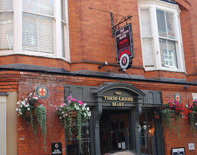
The other is a little more complex, but also clearly points to the brewery's ties to the City of York:
You can see the same arms from the first location used here on the base of the sign over the entrance and another just to the left of the door of The Three-Legged Mare, above.
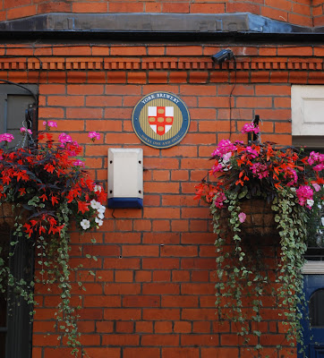
But it was also the other coat of arms on the face of the building that caught my eye.
Here, the emblem is clearly based on the arms of the City of York, but here they have changed the charges on the cross, five lions passant guardant or, to five tuns [or casks] or. The full blazon would thus be: Argent on a cross gules five tuns or.
Again, beautifully simple (albeit a little more complex than the first) arms, with clear references both to their location in the City of York and to their business of brewing beer.
It isn't often that you can find heraldry that says so much so clearly and simply. Would that more heraldry could be like this!


No comments:
Post a Comment