Thursday, November 30, 2023

Some Heraldry-Adjacent Business Logos/Signs


Of course, the Cross Keys (which we saw last time) is not the only business, or even the only type of business, to be identified in York, England, with a sign which is more or less heraldic.

Here are three examples:

First up, Barclays Bank.


Barclays logo, now a modern, highly-stylized eagle displayed azure, has always included the eagle, but it has changed over the years. You can find an historical review of how their logo has changed over the years on-line at https://twitter.com/Barclays/status/1405524076232278022?lang=en

Next, we come to the Blue Bell Pub and their (if it were heraldic, obviously canting*) logo:


I really can't add anything to the photographs above; they pretty much say it all.

And then we come to the Westgate Hair Lounge (or as their sign notes, "Hair and City Spa"):


Westgate's logo is clearly meant to invoke heraldry, consisting as it does of a large letter W in place of a shield, supported by two lions rampant, and surmounted in chief by a Marquess' coronet.

I find myself troubled the most by this display of sort-of heraldry. The lack of a shield means it really isn't heraldry, but with the lion supporters and, more especially, the marquess' coronet, we are clearly meant to take it as heraldic. But we cannot do so, because it is so clearly not heraldry. It seems they are trying to get the cachet of heraldry without making something truly heraldic.


* Franklyn and Tanner's An Encyclopaedic Dictionary of Heraldry informs us that canting arms are "an achievement in which the description of the figures is homophonous with the name; a rebus, or pictorial pun, also described as 'armes parlantes', and, er[roneously], as 'allusive arms'."

Or, as another old saw has it: "Heralds don't pun, they cant." (Not the lack of an apostrophe in the last word; it is deliberate.)

Monday, November 27, 2023

The Cross Keys: Wards Upward or Wards Downward?


The Cross Keys pub gets a brief mention in the "Public House Signs" section of the book Heraldry and the Buildings of York, noting that the original, which had opened in the first quarter of the 19th century, was demolished and the present one constructed in 1904, which date is commemorated in the panel set into the brickwork over the main entrance.

What the book does not mention, but which certainly caught my attention, is that the sign over the door and the sign in the guise of a coat of arms in the brickwork higher up, differ as to the orientation of the crossed keys: the latter has them with their wards upwards (the most frequent orientation for keys), while the former has them with their wards downwards. Not entirely unlike the line from the scarecrow in The Wizard of Oz: “Of course, some people do go both ways.”

As a consequence, though, you can see both orientations on the building there.

First, a couple of photographs of the building from two different angles:


And now for the close-ups. First, the sign, of the keys with their wards patently downwards:


And now, the same logo placed on a shield higher up on the façade of the building, of the keys with their wards just as patently upwards:


Which of these two orientations is the correct one?

I personally do not know, but if it came up for a vote, mine would go to the (presumably older) depiction in the brickwork just below the 1904 date.

Just sayin'.

Thursday, November 23, 2023

Once Again, You Can Find Heraldry Everywhere!


Well, today is Thanksgiving Day here in the United States, a major holiday where we take a day off from work and celebrate (or not) with family and stuff our faces with turkey (or ham) and, as they say here in the South, "all the fixin's".

Prayers of thanks and special thanksgiving ceremonies are common among most religions after harvests and at other times of the year. The Thanksgiving holiday's history in North America is rooted in English traditions dating from the Protestant Reformation. In the English tradition, days of thanksgiving and special thanksgiving religious services became important during the English Reformation in the reign of Henry VIII.

An annual thanksgiving holiday tradition in North American colonies is documented for the first time in 1619, in what is now the Commonwealth of Virginia.

The more familiar Thanksgiving precedent of feasting is traced to the Pilgrims and Puritans who emigrated from England in the 1620s and 1630s. They brought their previous tradition of Days of Fasting and Days of Thanksgiving with them to New England. The 1621 Plymouth, Massachusetts thanksgiving was prompted by a good harvest. The Pilgrims (among whom were three of my own ancestors) celebrated this with the Wampanoags, a tribe of Native Americans who, along with the last Patuxet, had helped them get through the previous winter by giving them food in that time of scarcity, and taught them how to grow their own food in a climate that did not necessarily favor the seeds they had brought from England.

Later, President of the United States George Washington proclaimed the first nationwide thanksgiving celebration marking November 26, 1789 as "a day of public thanksgiving and prayer, to be observed by acknowledging with grateful hearts the many and signal favours of Almighty God".

A Thanksgiving was proclaimed for all states in 1863 by Abraham Lincoln. Influenced by New Englander Sarah Josepha Hale, Lincoln set national Thanksgiving by proclamation for the final Thursday in November in celebration of the bounties that had continued to fall on the Union and for the military successes in the war, also calling on the American people, "with humble penitence for our national perverseness and disobedience .. fervently implore the interposition of the Almighty hand to heal the wounds of the nation..."

On October 31, 1939, President Franklin D. Roosevelt signed a presidential proclamation changing the holiday to the next to last Thursday in November in an effort to boost the economy by giving people an extra week to shop for the Christmas holiday. (Today, of course, we start seeing advertisements for Christmas around Halloween, October 31.)

But enough of the background of today's holiday, and on to its raison d'être, that of giving thanks.

And what am I thankful for this year?

I am thankful to have something that I have long said be confirmed once again: You can find heraldry (or heraldry-like objects) everywhere!

I have recently begun a new exercise routine, one which includes going to a nearby walking trail here in beautiful downtown Duncanville, Texas.

It was on my first circuit of that trail a short while ago that I went by a construction site surrounded by temporary fencing, upon which was a remarkably heraldry-like logo:


For a blazon (because I could find no background information or explanation of this logo on their websites), I would have to go with: Argent a Viking affronty wearing a horned helm and a cloak all sable within a bordure or the chief portion sable.

Now, all that is not to say that I think it's really great heraldry by any means. The bordure is mostly metal on metal, thus reducing its contrast, and the main charge on the shield is not especially distinguishable, so to my mind it rather fails at accomplishing what good heraldry should be; that is, a means of quick and easy identification.

Still, it is sufficiently simple and unique, and so probably serves its purpose well enough.

So there you have it! I am thankful today that I can still be surprised, and gratified, by finding heraldry and pseudo-heraldic logos everywhere! Even in a public park in a small suburban town in Texas.

Monday, November 20, 2023

More Alcohol-Related Heraldry: Pub Signs


Today's three heraldic stops on our tour of York, England, all have to do with the heraldic signs of three different pubs in the old city. I am going to treat them in alphabetical order, which also happens to be the order in which we go from least truly heraldic to most heraldic. Isn't it nice that it works out that way?

First up, the Golden Fleece inn and pub, whose sign is, obviously enough, a golden fleece.


Now, that is one very fat golden ram!

The Golden Fleece is mentioned in the York city archives as far back as 1503. The building it is in, though, was rebuilt in the 19th Century. And it claims to be the most haunted public house in York, and featured on an episode of Most Haunted. More information about the Golden Fleece can be found in its entry on Wikipedia at https://en.wikipedia.org/wiki/Golden_Fleece,_York

Then, we have the Golden Lion.


There are two different heraldic items on the Golden Lion's sign.

The first and most obvious is the lion's head cabossed or.

The other, less "in your face", is the crest atop the Greene King sign, Two arrows in saltire enfiled by a coronet or

Greene King is a brewery established in Bury St. Edmunds in 1799. You can learn more about the history of this company at https://www.greeneking.co.uk/our-company/our-history

And, of course, more about the Golden Lion can be found on the internet at https://www.greeneking.co.uk/pubs/north-yorkshire/golden-lion

Finally, we come to the most heraldic pub sign (even though the heraldry is not entirely accurate), the Duke of York.


Their website, https://lbdukeofyork.co.uk/, doesn't give us anything about the history of this pub, beyond letting us see that it is owned by Leeds Brewery Duke of York.

The arms shown on the sign are clearly those of the Plantagenet and Tudor kings and queens of England: Quarterly: 1 and 4, Azure three fleurs-de-lys or (France modern); 2 and 3, Gules three lions passant guardant in pale or (England).

These arms could refer to Edward Plantagenet, 4th Duke of York of the first creation, who seized the throne in 1461 as King Edward IV, when the title Duke of York merged in the crown; or to Henry Tudor, Duke of York of the third creation, who succeeded to the throne in 1509 as King Henry VIII, when the title merged in the crown.

(The second creation, in 1474, was to Richard of Shrewsbury, younger brother of King Edward V, who disappeared, and is believed to have been killed with his brother in the Tower of London during the reign of his uncle, King Richard III.)

The fourth (in 1605) and subsequent creations (most recently, in 1986 of Prince Andrew) would have used different arms that would have included Scotland and Ireland and dropped France.

All that said, technically speaking, the arms shown here are the arms of the King (or Queen) of England; the arms of the Duke of York in any of those creations had a charged label to difference them from the arms of the Crown: Quarterly: 1 and 4, Azure three fleurs-de-lys or (France modern); 2 and 3, Gules three lions passant guardant in pale or (England); overall a label argent charged with nine torteaux [red roundels].

Anyway, all in all it's an interesting display of heraldry, which can also teach us a little bit of history if we're willing to do a few minutes of research.

And that's all to the good, don't you think?

Thursday, November 16, 2023

More Alcohol-Related Heraldry


After looking at the two heraldic logos of the York Brewery, today we're going to see what other alcohol-related heraldry (and heraldry-adjacent logos) we saw during our stay in York, England.

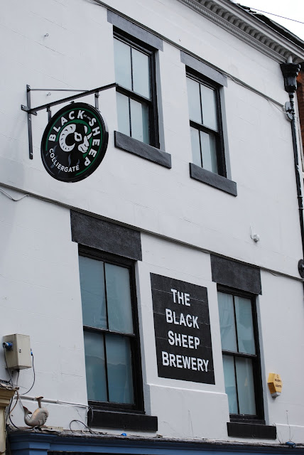
First up is another brewery, The Black Sheep Brewery, whose logo is really only heraldry-adjacent (though it would make a decent heraldic badge, without the lettering surrounding the ram's head.)


As a badge, I would blazon this as: A ram's head couped facing to sinister sable horned and marked argent.

While not heraldic in the strictest sense, it certainly functions well as an identifier, which really is one of the underlying basics for a coat of arms.
You can see more examples of The Black Sheep Brewery logo on their website at https://www.blacksheepbrewery.com/

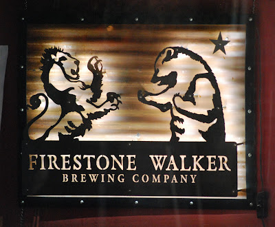
Next up is another quasi-heraldic logo, this one for the Firestone Walker Brewing Company:


The Firestone Walker Brewing Company (whose website is https://www.firestonebeer.com/), I found out, is a California-based brewery. It was founded in 1996 by Adam Firestone ("the Bear") and David Walker ("the Lion"). I suppose it's California, U.S.A. origin shouldn't have surprised me all that much, since the bear and star are most likely to be taken from the flag of the State of California (https://en.wikipedia.org/wiki/Flag_of_California).
They don't seem to have any blazonable tinctures for their logo; it all seems to be done in shades of tan and brown. Still, a decent blazon for it can be made: A demi-lion and a demi-bear combatant, in sinister chief a mullet.

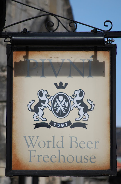
Finally, we came to the most heraldic of our examples today, the Pivni World Beer Freehouse:


I am not familiar with the names of all of the implements on their cartouche-shaped shield, though I am certain that all of them have to do with brewing. A blazon (without the names of the tools) would probably include that there are two in saltire surmounted by one in pale, overall two more in saltire, but that's a very "rough and ready" blazon, since the two sets which are "in saltire" do not overlie each other except in the very center of the shield, their differing angles allowing them to be seen (and identified) more easily.

For the rest, there is a generic crown above the shield, and the shield itself is being supported by two St. Bernard dogs. The scroll beneath the shield is the year the building they are in was built, 1597. Pivni was established here in 2007, according to their website: (https://pivni.co.uk/).

Next time, some heraldic pub signs seen in York!

Monday, November 13, 2023

Fun With Brewery Heraldry


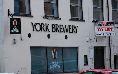
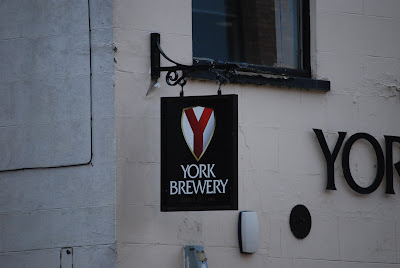
York Brewery, not surprisingly based in York, England, displays in places around the city a couple of different heraldic logos that I quite frankly found to be of interest.

One of them is a beautifully simply, yet meaningful design, which we found just across the street from our hotel in York:


It's blazon is remarkably simple: Argent a pall gules. The colors are patently based on the arms of the city, with its white shield and red cross, and the design, as anyone looking at it can see, places a bright and bold red "Y" for York on the shield.

Clear, easy to identify, using just two colors (white and red), and consisting of a field and a single charge. It doesn't get much better than that for heraldry.

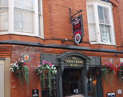
The other is a little more complex, but also clearly points to the brewery's ties to the City of York:


You can see the same arms from the first location used here on the base of the sign over the entrance and another just to the left of the door of The Three-Legged Mare, above.

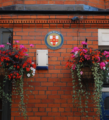
But it was also the other coat of arms on the face of the building that caught my eye.


Here, the emblem is clearly based on the arms of the City of York, but here they have changed the charges on the cross, five lions passant guardant or, to five tuns [or casks] or. The full blazon would thus be: Argent on a cross gules five tuns or.

Again, beautifully simple (albeit a little more complex than the first) arms, with clear references both to their location in the City of York and to their business of brewing beer.

It isn't often that you can find heraldry that says so much so clearly and simply. Would that more heraldry could be like this!

Thursday, November 9, 2023

Can You Figure Out the (Singular) Blazon from These (Multiple) Emblazons?


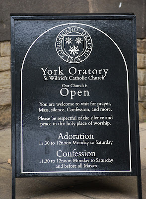
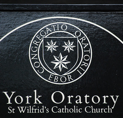
Today's conundrum: How are the attributed arms of St. Wilfrid blazoned? And can you get to that blazon from five (well, really four, because two of them are the same) emblazons of those arms?

Because, frankly, those varying emblazons are all (except for the two matching ones) significantly different.

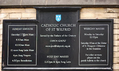
First, the three found wandering the streets of York, England; the one, and then the two matching ones:


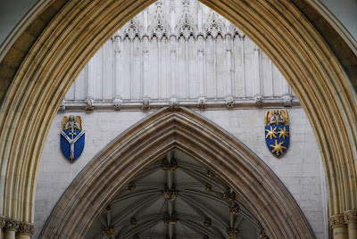
Then, this one, found on the exterior of York Minster:


And this one (on the right) from the interior the Minster:


So, knowing that these different depictions are all supposedly those of the attributed arms of St. Wilfrid, how would you blazon his arms?

Take and minute and think about it.

Feel free to click on any of the images above to go to a larger photo to look at them more closely.

How are these arms blazoned?

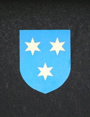
Just from looking at them, I would blazon the first one as: Azure three mullets of six points argent.

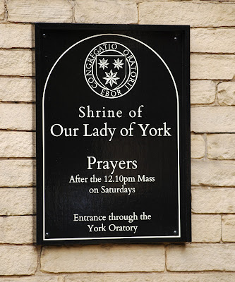
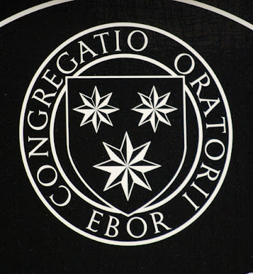
The next two (the matching ones), and assuming the same tinctures, I would blazon as: Azure three mullets of eight points argent.

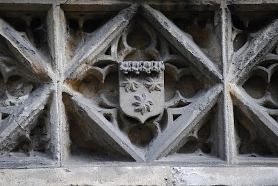
The third, from the exterior of York Minster, and the fourth, from the interior, are blazoned by Hugh Murray in Heraldry and the Buildings of York, and by Y.E. Weir in A Guide to the Heraldry of York Minster, as Azure three estoiles or.

The difficulties, in my own mind, are:

1. Mullets (of however many points) are not the same heraldically as mullets;

2. Estoiles are generally of six rays, while those here pretty clearly have seven; and

3. Estoiles do not have, as they seem to in the last image, circular centers.

Going out onto the internet and looking up other images of the attributed arms of St. Wilfrid, the majority tend to follow the pattern of Azure three estoiles of seven rays or.

But I have to wonder, should they really be suns? (Yes, I am well aware that suns are generally depicted with alternating straight and wavy rays. Still, that seems a little more likely than seven-rayed estoiles. But what do I know?)

Anyway, it's a bit of a puzzle, one that leaves us all a little something to think about.

Enjoy!

Monday, November 6, 2023

The Wheels on the Bus Go Round and Round (Part 2)


To finish our review of the arms/logos of the remaining six of the nine (out of 11) colleges of the University of York appearing on the buses following their routes in the City of York, I was better placed to catch this one on camera as it drove by:


You will note, if you compare this bus to the one in my last post, that the arms of the University of York do not appear here.

For the rest, we will visit the arms/logos of the remaining six college that I was able to capture in more detail.

(It did gratify my OCD sensibilities somewhat that they placed the arms/logos of the College from left to right in alphabetical order.)

As before, the tinctures in my blazons of these emblems come from the web pages of the individual colleges.

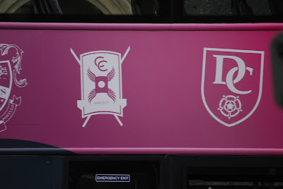
First up, Constantine College and Derwent College:


Constantine College: On a scutum purpure a billet pierced winged with four wings, the lower two reversed/inverted in chief the overlapping letters C C, surmounting the shield in base a straight scroll gray charged with the Roman numerals MMXIV argent.

Derwent College: Azure (really, it’s Navy Blue, very dark!] in chief the interlaced letters D C and in base a double rose all argent.

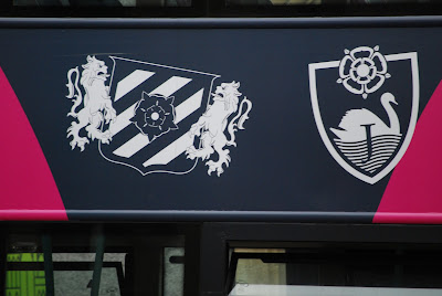
Then Halifax College and James College:


Halifax College: Argent four bendlets azure a double-rose argent barbed and seeded proper all within a bordure argent, the shield supported by two lions rampant or, the supporters overlapping more than usual the shield on each side.

James College: Argent a swan naiant to sinister atop waves of water sable both debruised by the letter J argent in chief a rose argent extending beyond the chief edge of the shield.

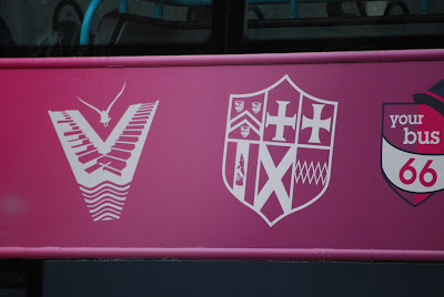
And finally, Vanbrugh College and Wentworth College:


Vanbrugh College: An entirely unheraldic logo, consisting of a V marked like piano keys to dexter and like steps to sinister, the lower part barry wavy, and in chief a bird volant affronty? aversant?. The “shield” on their page on the University website (https://www.york.ac.uk/colleges/vanbrugh/) is only marginally more heraldic.

Wentworth College: Quarterly of six: 1, Sable a chevron between three leopard’s faces or; 2, Argent a cross couped grady of three sable; 3, Argent a cross couped formy sable; 4, Argent on a pale sable an eel’s head or; 5, Gules a saltire argent; and 6, Gules a fess of five fusils conjoined or. The quarterings are taken from the even-more-quartered arms of the College’s namesake, Thomas Wentworth, 1st Earl of Stafford.

I feel pretty good about catching on camera as many of these shields/logos as I did, considering that the bus driver wasn't going to stop for me to catch all of them.

On the other hand, I was left feeling a bit sad that no one with any real familiarity with heraldry seems to have been involved in the creation of these designs, and that even the most truly heraldic ones contain some pretty conspicuous errors.

Thursday, November 2, 2023

The Wheels on the Bus Go Round and Round (Part 1)


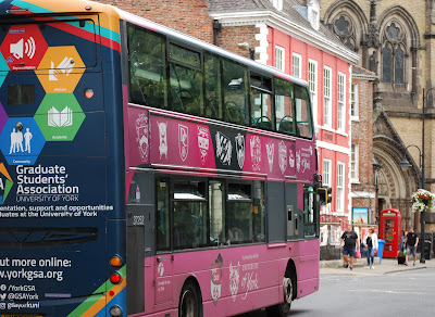
The City of York has a fairly extensive public transportation system, one part of which is city buses, painted mostly purple (lilac? pinkish?) and advertised as "In Partnership with the University of York".

As the buses were moving every time I saw one, it was a bit tricky to get pictures of all of the heraldry, and logos, painted on their sides. Still, I managed to get the majority of them, and will discuss them in this post and the next one.

To give you an idea of what I was seeing there, here's one of the buses, with nine shields/logos along its side, as well as two shields, one at the far end of the upper row, and another down between the front and rear wheels. (You'll probably want to click on the image below to go to the full-size version, where you can see the details better.)


It turns out, the nine shields/logos along the side are nine of the eleven colleges that make up the University of York. The other two shields, upper and lower, are the arms of the University itself. Though you couldn't tell it from the colors they are painted here, the arms are blazoned: Azure on a chevron ermine three closed books fesswise proper each with two clasps downward or.

The three shields/logos which I was not quite fast enough to catch on my camera are, from left to right:

On the far left: Alcuin College, Gules on a chevron sable between in chief an open book and an oak tree and in base eleven [mullets? roundels?] in the form of a broadhead, the letters ALCUIN all argent.

Fourth from the left: Goodricke College, Vert on a fess between two lions passant argent a fleur-de-lis between two crescents vert. Clearly, one of the more heraldic college shields!

And seventh from the left: Langwith College, Argent to dexter a tree with drooping leaves and to sinister in pale a rose all outlined and the interlaced letters L C sable.

I obtained the tinctures of these from the University of York website and the pages of the respective colleges.

Next time, another bus, and close-ups of the other six designs, both heraldic and not.